
3 Web Design Trends for 2015


Oct 21, 2014


Once again, another year has whizzed by and 2015 is sneaking up on us. In this post, we’ll take a look at some design trends that are currently gaining traction and that we think will be quite popular in 2015.
1) Mobile, mobile, mobile

In 2015 if you’re not designing your site for a mobile audience, you’re definitely missing out. Even if your target audience isn’t looking for your business while on the go (i.e. if you’re a B2B business), having a mobile site ready to go when your customer does decide to find you on mobile is key. An easy way to make sure your site is ready for whatever device your customer decides to use is to build your site out responsively. This means the site will automatically adjust what is shown to the visitor based on the device they are using.
2) Large background images and videos
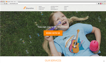
Out with the sliders and carousels and in with the large images and videos. A large background image or video is growing in popularity due to its simplicity and elegance. Usually posted above the fold on a homepage, this prime real estate used to be reserved for sliders and carousels; however, studies are finding that carousels are not very engaging and users don’t even read the information on the slides. A large image helps tie the whole site together and a video that either plays in the background (behind the text) or that is a prominent feature is very engaging.
Notice in our example above, Shoreline (a custom apparel company) combines a large image with a carousel; however, they make it simple by having one short sentence and a CTA that makes it easy for visitors to comprehend what they're seeing and take action if they want.
3) Minimalism wins

Like the large background images, minimalism in web design is starting to take over. This means sites with less pages and clicking and more scrolling. A long scrolling site is perfect for those who are on mobile devices like tablets and smartphones and will less clicking, your site’s UX can be improved (mind you, you can’t just assume that a long, one-page site means you’ll have great UX, but it can help users who might get lost in the shuffle of sites with a multitude of pages).
Whitmans, shown above, is a great example of a long scrolling site that is simple, elegant, and provides all the information their customers would need.
While these trends may be popular, that doesn’t mean you need to incorporate them all into your site. You should keep your website goals and user experience front-and-center when designing your site and incorporate these trends only if and when they make sense for your site.
-
-

 Oshyn
Oshyn
-
 Oshyn
Oshyn
Takeaways From Adobe Summit 2025
Agents, Creativity, and Vibrance
-

 Fernando Torres
JotForm
A Comprehensive Guide
This site is protected by reCAPTCHA and the Google Privacy Policy and Terms of Service apply.