
Using Visual State Manager and Toggle Button


Nov 09, 2011
The visual state manager is one of the best new features of Expression Blend 4. It allows you to define element's visual states and record them with the name of your choice, for example MouseOver, ButtonPressed, Checked, etc.
In this Post, I'm going to demonstrate how to use the visual state manager with a very useful control that’s called ToggleButton. The toggle button looks just like a regular button by default, but it has two predefined states that you can use and that toggle between each other when you click on the button. This will be clearer with the demo.
Ok, first open Expression Blend and create a new project; it can be a Desktop App or a Silverlight App, it doesn't make any difference, for this example I'm working with a WPF Application (Desktop).
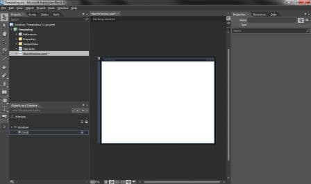
You will see the following:
Ok, now click on the arrows at the bottom of your left tool box and search for "ToggleButton"
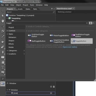
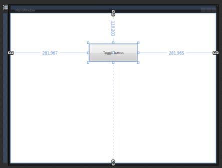
Once you've selected it, insert it on your main window.
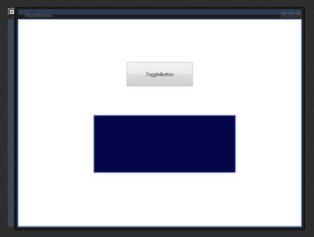
Now, let's draw a simple shape to use in the visual state manager. Just select the rectangle tool and draw a rectangle on your Grid.
Paint it any color you want, I'm going to be using a dark blue.
This is were the fun part begins!! Click on the states tab at your top left, it will be empty.
First you need to Add a State Group by clicking on the button

Rename your state as you prefer, in this case I'm using "ToggleStates".
After this, create a couple of states by clicking on "Add State"
Rename those to "RectangleBlue" and "RectangleYellow".
Notice that when you click on any of these states a red line will appear around your workspace and a recording on message will show. So, let's start by clicking the "RectangleYellow" state.
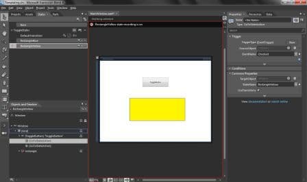
So, why do we call it RectangleYellow? You got it... let's change the color of the rectangle to yellow and after we can stop recording by clicking on the "Base" state.
Once we've defined our visual states we can go ahead and use them with our toggle button.
Click the "Assets" tab right next to the "States" tab, select "Behaviors" and drag a "GoToStateAction" to your toggle button in the Objects and Timeline menu.
Repeat this process because we will need to triggers.
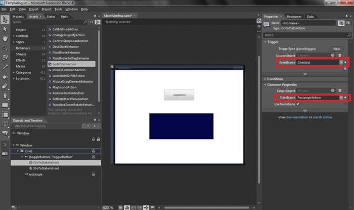
Now you just need to define when to trigger your states. Click on one of the "GoToStateAction" from your Objects and Timeline menu, and on the properties menu select:
- EventName: Checked
- StateName: RectangleYellow
This will trigger the state you just defined when the toggle button is checked.
For the other "GoToStateAction" use the following properties:
- EventName: Unchecked
- StateName: RectangleBlue
This will return to your blue state when the button's state is Unchecked.
Recent Insights
-

-

-

 Fernando Torres
Tailwind CSS in Modern Web Development
Integration with AEM, Sitecore, and Optimizely
-


