
Jan 16, 2023
Not sure UX is worth investing in? Here are 8 real risks of having a poor user experience on your website - and the stats to back them up!
Every website has a user experience.
The question is whether it’s a good one, or a bad one.
Most businesses today understand the importance of investing in user experience design (UXD). Experts estimate that at minimum, at least 10% of a project’s budget should be devoted to UX design. However, more successful projects dedicate up to 40%.
If you’re wondering if this is one investment you can skimp out on, here are eight reasons that will make you think again.
Below, we review the risks – and the costs – of having a poor user experience on your website.
1. Poor UX reduces online revenue.
Good UX design isn’t about making things pretty. It’s about providing an intuitive, seamless experience for your users that makes them want to explore, engage, and ultimately, convert.
A poor user experience translates to lost sales and lost revenue, period. A good user experience, on the other hand, is associated with a conversion rate lift of 200% to 400%, according to recent research from Forrester.
2. Poor UX lowers your average order value (AOV).
A poor user experience negatively affects your overall revenue. It also significantly limits your AOV.
The logic behind this is simple. If you have a bad design, your customers can’t easily find other products or services to purchase.
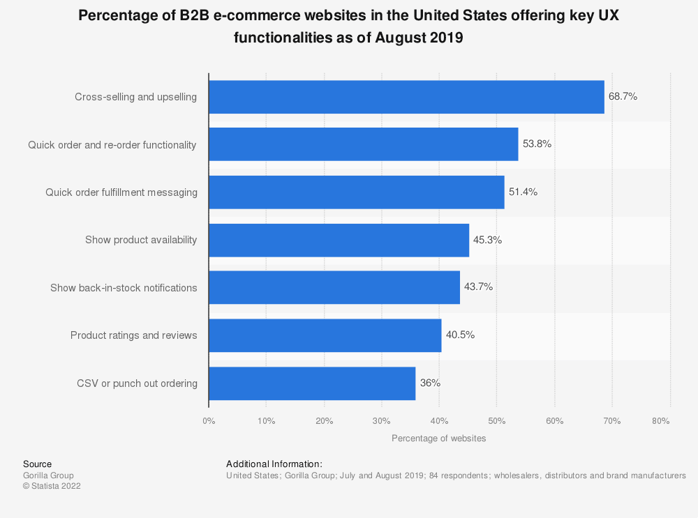
According to Statista, over 68% of B2B websites lack cross-sell and upsell features, and only half offer quick reordering and clear fulfillment messaging. These are critical aspects of a good user experience that drives conversions and revenue.

Find more statistics at Statista
3. Poor UX increases cart abandonment.
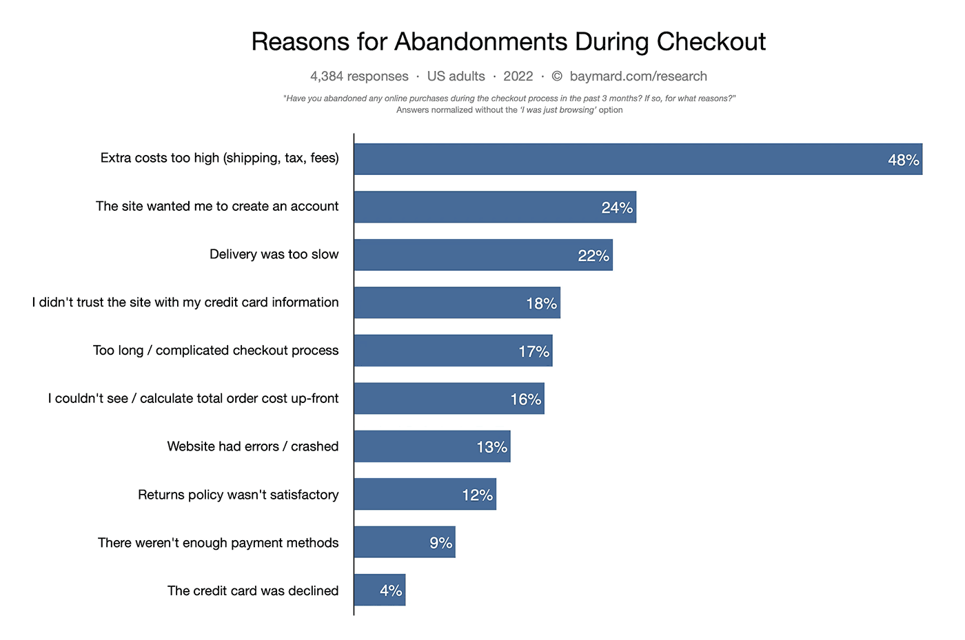
The average cart abandonment rate hovers just under 70%, according to the Baymard Institute. Here are the top reasons why people abandon their cart at checkout:
Of these, exactly half are due to a poor user experience:
-
The site wanted me to create an account (24%)
-
Too long / complicated checkout process (17%)
-
I didn’t trust the site with my credit card information (18%)
-
I couldn’t see / calculate total order cost up-front (16%)
-
Website had errors / crashed (13%)
Experts estimate that the average large ecommerce site can enjoy a 35% lift in conversion rate by redesigning their checkout experience. That’s a lot of money to be leaving on the table!
4. Poor UX damages your brand perception.
We’ve all experienced it. When a site doesn’t make things easy, it’s incredibly frustrating as a user.
One way to vent that frustration? Telling other people how a brand let you down. Stats show people are significantly more likely to rant about a negative experience than rave about a positive one. 13% of people will tell fifteen people – or more – about a negative experience they have on a brand’s website.
It takes a long time to grow brand equity. You can destroy it in seconds with a poorly put-together website.
5. Poor UX increases your customer acquisition costs.
According to PwC, one in three customers will leave after a single poor experience with a brand.
When you have a poor user experience, it not only impacts your ability to retain customers; it impacts your ability to acquire new ones as well.
Why? A poor user experience creates a leaky funnel.
Let’s say your website takes forever to load, it’s difficult to use, and your customers are frustrated. As a result, you can expect a high site abandonment rate.
Now, in order to maintain your baseline sales goal, you need to increase the number of people who visit your website in the first place, which means you have to increase your marketing and advertising spend – only to have much of it ultimately go to waste. Bad UX creates a lot more work, for way less return.
6. Poor UX can hurt your SEO.
Four in ten people will stop engaging with a website when it takes too long to load. That’s why Google has increasingly started including user experience metrics in their ranking algorithms. In their own words, “users show they prefer sites with a great page experience.”
In 2020, Google rolled out the page experience update, which focuses on UX metrics like how fast a site loads, how quickly a user can begin to engage with it, and more.
Google wants to prioritize websites that provide a good user experience. Make sure yours fits that description, or you might notice your rankings take a dip.
7. Poor UX can eat into your digital marketing budget.
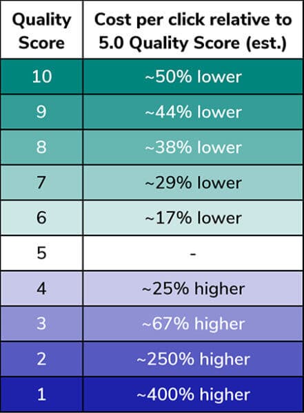
Poor UX hurts your SEM efforts, too. Brands with poorly designed websites end up paying more for their Google Ads campaigns.
How much more? Between 25% to 400% more, according to some estimates:

Ad campaigns with lower Quality Scores get saddled with higher costs per click and reduced return on ad spend (ROAS).
What does Google consider when assigning Quality Scores? If you guessed UX, you’d be correct. Along with ad relevance and clickthrough rate, the usability of the landing page experience is factored in. When your landing pages provide poor user experience, people are more likely to bounce, lowering your ad’s Quality Score and ROAS as a result.
8. Poor UX puts you at a competitive disadvantage.
It’s not the 90s anymore. Today’s internet users have expectations. They expect websites to anticipate their needs, offer solutions, and engage and entertain them along the way.
If your brand doesn’t deliver that kind of experience, they know they can get it somewhere else – most likely with your competitors.
Savvy brands are investing in user experience design to deliver not just a bare-minimum experience, but to go above and beyond in delighting their customers. In an increasingly competitive environment, doing the bare minimum is no longer adequate. You must wow and entertain your customers, and make their lives easy. Good UX can help you do that.
Bad news, good news
Poor user experience can hurt you. That’s the bad news.
Fortunately, the good news is that the benefits of a well-designed user experience are significant – and exponential.
According to Nielsen Norman Group, the average website enjoys a usability increase of 135% after a UX redesign, along with significant lifts to key performance indicators like:
-
150% lift in traffic
-
161% lift in user productivity
-
202% increase in use of target features
-
100% lift in sales or conversion rate
To help design teams create a better, more successful user experience, Oshyn offers Design Support for Sitecore to help ensure that the desired user experience is realized. Contact us to learn more.
Related Insights
-

-

 Kimberly McCabe
-

Oshyn
How to Select a Tech Partner
A Complete Guide for Marketers


