

Sitecore Mobile: Render Your Site for Mobile Using Sitecore


Dec 22, 2009


I'd like to discuss the benefits of working with Sitecore when you need to deliver distinct rendered views depending on the device the client is using, in this case mobile.
The general steps to get your site displayed differently based on the device are the same no matter what kind of site or device you target. Let's check them out.
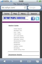
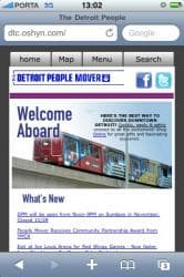
I'm going to use some basic code used for a demo we did recently for an important client, The Detroit People Mover. Basically we decided the usual layout use for the site to be displayed in a normal browser would be really awkward for the client visiting the site via mobile.
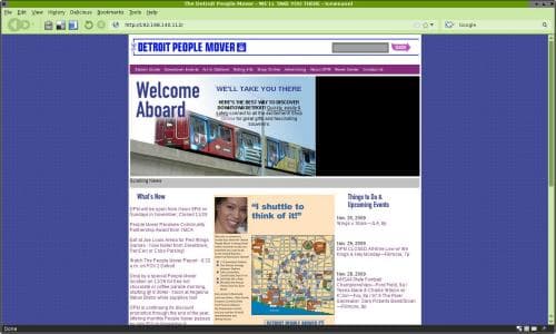
The important idea behind a site design for mobiles is to keep in mind that the client has a reduced display are and just few possibilities to interact with the site (e.g. the iPhone doesn't work well with flash animations), so the first thing you need to do is to extract the most important parts of the site to highlight them. This is how we do it.
Now we have the mobile site design we need to get a good front-end developer to create this design in code, specifically in .net code, because the layouts in Sitecore are created as aspx files; the controls/placeholders could be ascx or xsl files.
These are some quick snippets of the main layout and the home and menu placeholders:
Main Layout: - iPhoneLayout.aspx
<div id="tab-1" class="scGridDesignerArea">

<sc:placeholder runat="server" key="content"></sc:placeholder>

</div>

<div id="tab-2" class="scGridDesignerArea">

<sc:placeholder runat="server" key="map"></sc:placeholder>

</div>

<div id="tab-3" class="scGridDesignerArea">

<sc:placeholder runat="server" key="menu"></sc:placeholder>

</div>

<div id="tab-4" class="scGridDesignerArea">

<div class="search scGridDesignerArea" id="ctl10">

<form class="search-box" action="#" method="get">

<input type="text" name="dpms" class="search-text" size="30" />

<input type="submit" value="" class="search-button" />

</form>

</div>

</div>
Home Placeholder: - iPhoneContentLayout.ascx
<div class="home-image">

<img id="home-banner" />

<div id="home-banner-title" class="">

<p class="page_title"></p>

<p class="normal">

<sc:placeholder runat="server" key="banner-text"></sc:placeholder>

</p>

</div>

</div>

<div class="clear"></div>

<!-- Content -->

<div id="home-content" class="">

<sc:placeholder runat="server" key="main-content"></sc:placeholder>

</div>
Menu Placeholder: - TopMenuRendering.xslt
<ul id="main-menu">

<xsl:for-each select="$home/item" >

<li class="site-section">

<sc:link><sc:text field="menutitle" /></sc:link>

<xsl:if test="sc:fld('menutitle',.)='Station Guide'">

<ul class="submenu">

<xsl:for-each select="./item" >

<li class="submenu-item">

<sc:link><sc:text field="name" /></sc:link>

</li>

</xsl:for-each>

</ul>

</xsl:if>

</li>

</xsl:for-each>

</ul>
After your front-end developer had finished implementing the mobile design, you need to set up Sitecore so it can know what layout to deliver based on the device. To do this you just need to go to this path: /Sitecore/Layouts/Devices
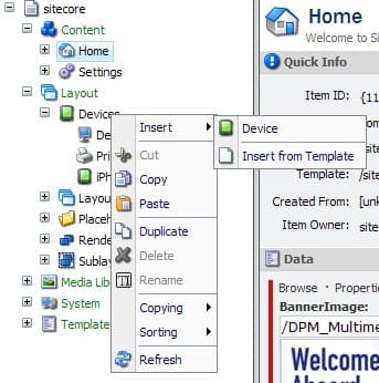
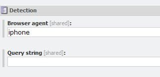
Once there, right click on the Devices icon, and select insert->device, call it iPhone or whatever you want (we decided to serve this render for iPhones, that's why we choose that name). Here's the MOST important part - Browser Agent: you can choose to use a query string which contains the browser info sent by the the browser or you can directly type the browser agent. Sitecore supports the most modern devices, so you just need to type iPhone, BlackBerry, WebOS, or just experiment with the model you're trying to target.
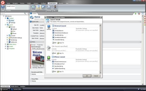
After you finish this step, please go to the page you want to configure with the new layout, right click in the content you want, in the ribbon select "Presentation"->"Details" and then select the mobile device you just created and associate to it the specific layout with its controls.
And that's it, you just need a mobile device to test your site. Enjoy it! ;)


This site is protected by reCAPTCHA and the Google Privacy Policy and Terms of Service apply.